dmv redesign
Spring 2019 - 5 weeks
In my sophomore year, we took on the task of improving America’s most hated activity. Any interaction with the DMV is boring, frustrating, and ideally avoided at all costs. So, the task of this project was to focus on UI and redesign a form on their website to be interactive and an overall better experience.
the problem
Currently, the DMV website has one fillable PDF that is supposed to be used for many different purposes. The information is cramped, confusing, and borderline illegible. It makes it near impossible for the user to figure out what they need to do.
the solution
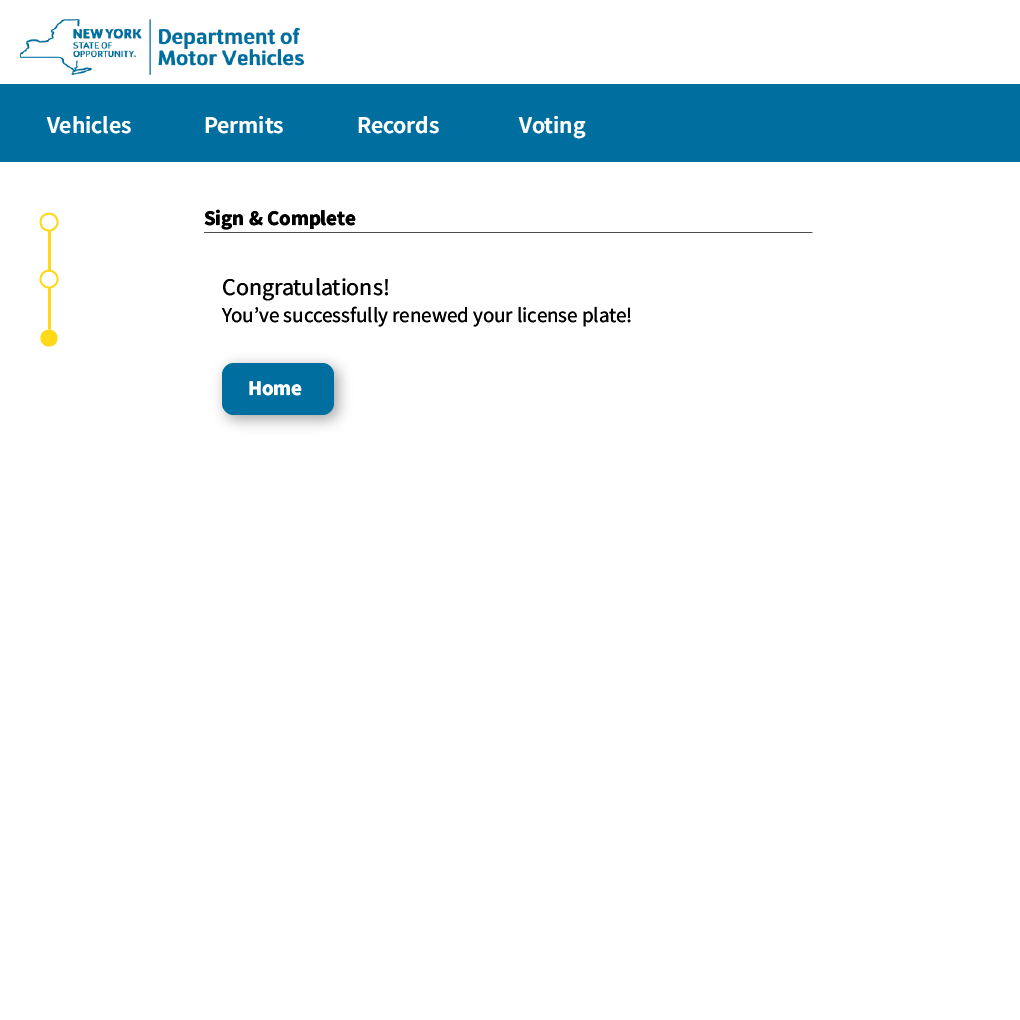
I chose to simplify the form by only showing the user the information that is immediately relevant. By making it an interactive form that’s broken up into steps, it is significantly less overwhelming.
low-fi wireframes
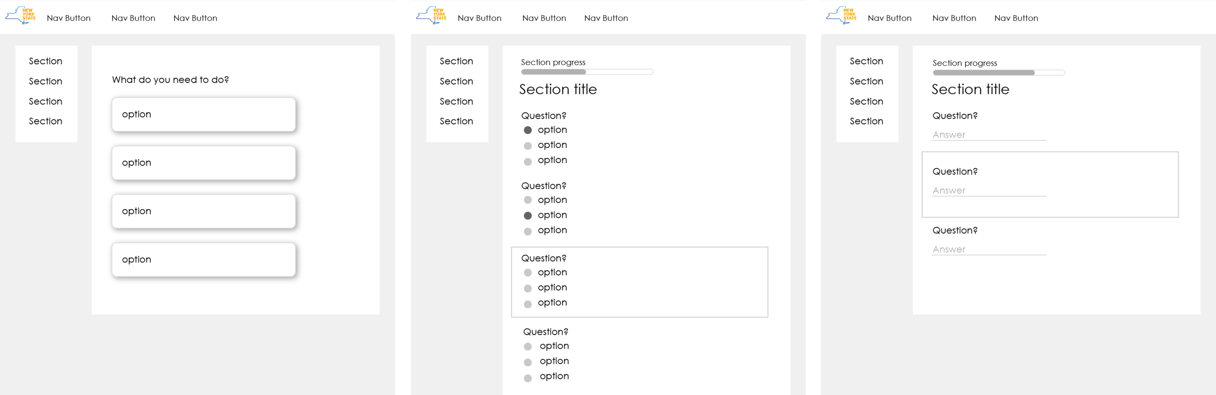

Process is streamlined right off the bat by the ability to search your information.

Questions are asked to see if further information is needed from the user.

Further information is needed so the form expands.


next steps
Going further, I want to improve my progress tracker to better assist the user. My current yellow side bar is not really indicative of what it does. In addition, I want to add some context to my designs so the user is able to understand where this interactive form exists in the website.